
Introduction
In today’s digital era, your website is the face of your brand. Whether you are a business owner in Mumbai or a startup founder in Bangalore, your website’s design can make or break the first impression. Good web design does not just have to look good – it also requires functionality, clarity, and user engagement. If you are planning to build a new website or want to improve an existing site, it is very important to understand these 5 golden rules of web design.
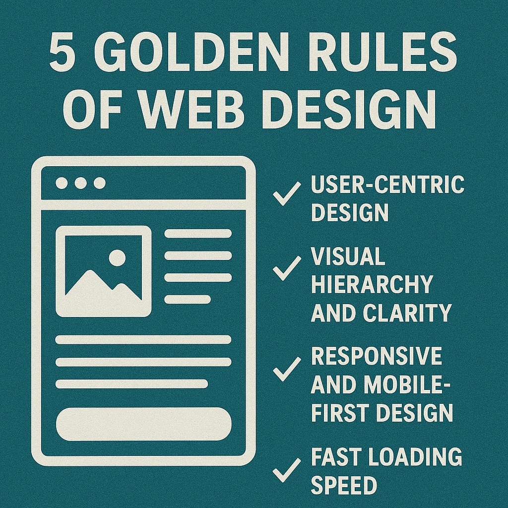
1. User-Centric Design
Your website should always be designed with the user in mind. Understand your audience – what they are looking for, how they navigate the website, and what problems they have that they want solved.
When you design from the user’s point of view, you can give them a smooth, helpful, and engaging experience.
- Always keep the interface clean and intuitive, meaning the user should understand what to do without thinking.
- Keep the navigation simple – the user should easily reach every section
- Use clear CTAs – like “Buy Now”, “Sign Up”, or “Learn More”
- Every clickable item should be easily noticeable, so that the user does not have confusion while clicking
- Simple and understandable design engages the user and reduces bounce rate.
In India, users often access websites via mobile, so mobile responsiveness must be part of the user-first strategy.
2. Visual Hierarchy and Clarity
Your visitors won’t waste time trying to figure out what’s important – your design will show that. A visual hierarchy helps users process information quickly and easily.
- Use different font sizes, weights, and colors to indicate importance
- Place the most important information above the fold
- Use whitespace effectively to avoid clutter
For example, if there is a product-based website, then it should clearly and prominently display the main features, price, and the “Buy Now” button.
When the user visits the website, he should immediately understand what the product does, how much it costs, and how to purchase it, without any confusion.
3. Responsive and Mobile-First Design
According to multiple studies, over 70% of internet users in India access websites through mobile devices. If your site doesn’t load or function well on smartphones, you’re losing visitors.
- Use fluid grids and flexible images
- Prioritize fast loading speeds
- Avoid Flash or heavy elements
- Test across various screen sizes
A mobile-first approach ensures better performance and user retention.
4. Fast Loading Speed
Website speed is an important ranking factor for search engines, and it also directly affects your bounce rate. If the site is slow, users leave quickly.
- Compress images without losing quality
- Minimize code, leverage browser caching
- Use a CDN (Content Delivery Network) for better speed in remote areas
- Avoid autoplay videos and background scripts that slow down the page
In India, where internet speeds vary from place to place, fast-loading websites perform better and attract a broader audience.
5. Consistency and Branding
Consistency builds trust. If your logo, colors, or typography change on every page, users may doubt your professionalism.
- Use a fixed color palette and font styles
- Keep navigation elements consistent
- Align your content with brand voice
A strong, unified identity ensures your website becomes recognizable and trusted over time.
Final Thoughts
These 5 golden rules of web design apply universally, but their importance is even more prominent in fast-growing digital regions like India. Whether you’re building an e-commerce site, a blog, or a business portfolio, following these principles will improve engagement, reduce bounce rates, and increase conversion.
FAQs on Web Design
Q1: What is the most important rule of web design?
A: User-centric design is the most crucial rule. The entire experience should revolve around making navigation and interaction easy for your audience.
Q2: Why is responsive design important in India?
A: A large portion of Indian users access websites through smartphones, making mobile responsiveness a top priority for broader reach.
Q3: How does web design affect SEO?
A: Good web design improves user experience, loading speed, and mobile-friendliness—all essential SEO ranking factors.
Q4: What tools are best for responsive web design?
A: Tools like Figma, Adobe XD, and frameworks like Bootstrap and Tailwind CSS are widely used for responsive designs.
Q5: How can I test my website’s design performance?
A: Use tools like Google PageSpeed Insights, GTmetrix, and BrowserStack to test performance, responsiveness, and compatibility across devices.
Need help implementing these golden rules on your site?
Check out how Revopions is helping businesses in India create fast, user-friendly, and SEO-optimized websites with expert design strategies.